Logos
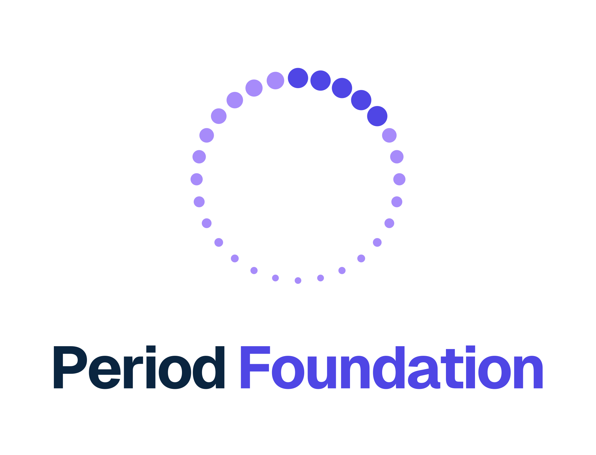
1 · Stacked logo (main)
Mark above, name below. For covers, posters and profile images.
2 · Horizontal logo
Mark left, name right. For headers, e-mail signatures and slides.
What the mark means
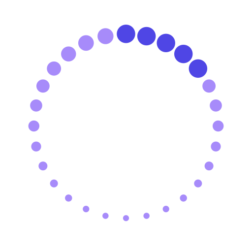
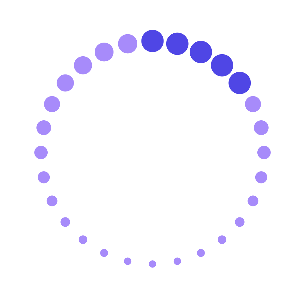
- 28 dots: one cycle, one dot per day.
- 5 big indigo dots: the period days. They are the biggest because the sample comes from them.
- 23 lilac dots: the rest of the cycle.
- The ring: many women, one shared dataset. The period starts at 12 o’clock.
Please
- Keep empty space around the logo at least as tall as the letter “P”.
- Minimum size: the mark at least 24 px on screen or 8 mm in print.
- Do not rotate, recolour or stretch the logo, or change its font.
- Use the white logo on dark backgrounds, and never place it on a background with weak contrast.
Colours
In the logo
- Indigo
#4F46E5 - Lavender
#A78BFA - Navy
#0A2540 - Light lilac
#C4B5FD
Accent
- Coral
#FF5C7A - Light coral
#FFC2CE
For highlights and campaigns, never inside the logo. Coral is hard to read on white or indigo: use it for dots, shapes and buttons, or for text on navy. Light coral works for large or bold text on indigo, as in the manifesto.
Font
Geist, a free font under the SIL Open Font License. vercel.com/font
Name and hashtag
Write “Period Foundation”, two words. Our hashtag is #MyPeriodCounts.
About us, to copy
Short descriptions in English and German you can use as they are.
ENPeriod Foundation is the women's health data movement, starting in Vienna. Women give period samples for a year and decide with us how they're used.
DEDie Period Foundation ist die Bewegung für Daten zur Frauengesundheit, gestartet in Wien. Frauen geben ein Jahr lang Proben ihrer Periode und entscheiden mit, wie sie genutzt werden.
Legal name: Period – Verein zur Förderung der Menstruationsforschung (in Gründung)
Need something else?
Other formats, photos or an interview: write to us.
hello@period.foundation